
In this article, we will explore the creation of a bottom navigation bar in Flutter, taking advantage of the capabilities of this powerful framework for mobile application development. The bottom navigation bar is a fundamental widget that allows you to build an intuitive and efficient tab-based user interface for your application.
Throughout this article, I will guide you through a practical example where we will use the provided code to implement this bottom navigation bar. You will learn the fundamental concepts of the widget, as well as how to customize it to perfectly suit the specific needs of your application.
You will discover how to take advantage of Flutter’s versatility and wide range of widgets and tools to create high quality user interfaces.
Getting Started
Before we dive into the code, make sure you have Flutter installed on your machine. You can find installation instructions on the official Flutter website here.
Crear un nuevo proyecto Flutter
Una vez que haya instalado Flutter, puede crear un nuevo proyecto ejecutando el siguiente comando en su terminal:
flutter create my_app
Then, replace the contents of the main.dart file with the next code provided.
// Import the material package from Flutter.
import 'package:flutter/material.dart';

// The main function starts the app.
void main() {
  // Run the app with MyApp as the root widget.
  runApp(MyApp());
}

// MyApp is a stateful widget.
class MyApp extends StatefulWidget {
  @override
  State<StatefulWidget> createState() => _MyAppState();
}

// _MyAppState is the state of MyApp.
class _MyAppState extends State<MyApp> {
  // Define the initial index of the bottom navigation bar.
  int _currentIndex = 0;

  // Define the list of widgets to be shown in the bottom navigation bar.
  final List<Widget> _children = [    Home(),    Settings(),    Profile(),    Notifications(),  ];

  // This function is called when an item in the bottom navigation bar is tapped.
  void onTabTapped(int index) {
    setState(() {
      _currentIndex = index;
    });
  }

  // The build method creates the widget tree.
  @override
  Widget build(BuildContext context) {
    return MaterialApp(
      title: 'Flutter Bottom Navigation Demo',
      theme: ThemeData(
        primarySwatch: Colors.blue,
        bottomNavigationBarTheme: BottomNavigationBarThemeData(
          backgroundColor: Colors.white,
          selectedItemColor: Colors.blue,
          unselectedItemColor: Colors.grey,
          selectedLabelStyle: TextStyle(fontWeight: FontWeight.bold),
          unselectedLabelStyle: TextStyle(fontWeight: FontWeight.normal),
        ),
      ),
      home: Scaffold(
        // Add an app bar with a title.
        appBar: AppBar(
          title: Text('Flutter Bottom Navigation Demo'),
        ),
        // Set the body of the scaffold to be the current widget in _children.
        body: _children[_currentIndex],
        // Add a bottom navigation bar with four items.
        bottomNavigationBar: BottomNavigationBar(
          onTap: onTabTapped,
          currentIndex: _currentIndex,
          items: [
            BottomNavigationBarItem(
              icon: Icon(Icons.home),
              label: 'Home',
            ),
            BottomNavigationBarItem(
              icon: Icon(Icons.settings),
              label: 'Settings',
            ),
            BottomNavigationBarItem(
              icon: Icon(Icons.person),
              label: 'Profile',
            ),
            BottomNavigationBarItem(
              icon: Icon(Icons.notifications),
              label: 'Notifications',
            ),
          ],
        ),
      ),
    );
  }
}

// Home is a stateless widget.
class Home extends StatelessWidget {
  @override
  Widget build(BuildContext context) {
    return Center(
      child: Text(
        'Home Screen',
        style: TextStyle(fontSize: 24),
      ),
    );
  }
}

// Settings is a stateless widget.
class Settings extends StatelessWidget {
  @override
  Widget build(BuildContext context) {
    return Center(
      child: Text(
        'Settings Screen',
        style: TextStyle(fontSize: 24),
      ),
    );
  }
}

// Profile is a stateless widget.
class Profile extends StatelessWidget {
  @override
  Widget build(BuildContext context) {
    return Center(
      child: Text(
        'Profile Screen',
        style: TextStyle(fontSize: 24),
      ),
    );
  }
}

// Notifications is a stateless widget.
class Notifications extends StatelessWidget {
  @override
  Widget build(BuildContext context) {
    return Center(
      child: Text(
        'Notifications Screen',
        style: TextStyle(fontSize: 24),
      ),
    );
  }
}
Let’s take a closer look at the code for the Bottom Navigation Bar
The MyApp class is a StatefulWidget, which means it has mutable state that can change over time. We define a _currentIndex variable to keep track of which tab is currently selected, and a _children list to hold the screens that correspond to each tab.
In the onTabTapped method, we update the _currentIndex variable with the index of the newly selected tab. This triggers a rebuild of the widget, which updates the UI to display the corresponding screen.
In the build method, we define the app’s theme and create a MaterialApp widget. Within the MaterialApp widget, we define a Scaffold widget, which provides a basic layout for the app. The Scaffold widget contains an AppBar at the top, a body in the middle, and a BottomNavigationBar at the bottom.
The AppBar displays the app’s title, and the body displays the current screen based on the value of _currentIndex. The BottomNavigationBar displays a list of tabs, with icons and labels for each one. We pass in our _children list to the BottomNavigationBar so that it knows which screens to display when each tab is selected.
Finally, we define four StatelessWidget classes for each screen: Home, Settings, Profile, and Notifications. Each screen simply displays a centered text widget with the screen’s name.
Customizing the Bottom Navigation Bar
The Bottom Navigation Bar is highly customizable, allowing you to change its appearance and behavior to fit your app’s needs. Here are some examples of how you can customize the BottomNavigationBar widget:
– Change the background color: You can change the background color of the Bottom Navigation Bar by setting the backgroundColor property of the BottomNavigationBarThemeData class in the app’s theme.
– Change the selected and unselected item colors: You can change the color of the selected and unselected items in the Bottom Navigation Bar by setting the selectedItemColor and unselectedItemColor properties, respectively.
– Change the label styles: You can change the font style of the labels for the selected and unselected items by setting the selectedLabelStyle and unselectedLabelStyle properties, respectively.
Finally, we run the following command:
flutter run
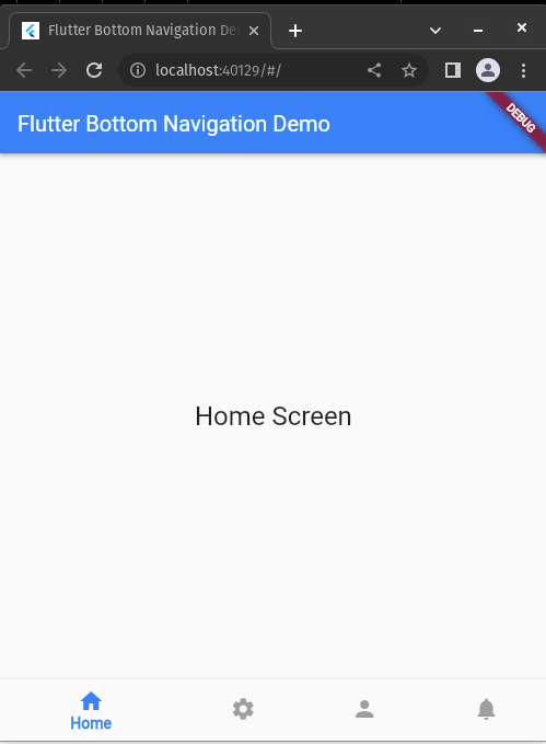
And here is a screenshot of the app:
Conclusion
In this article, we walked you through an example of how to create a Bottom Navigation Bar in Flutter. We covered the basics of how the widget works, and how to customize it to fit your app’s needs.
Flutter offers a wealth of powerful tools for building high-quality mobile applications, and the Bottom Navigation Bar is just one example of the many widgets available. With some practice, you’ll be able to create complex and beautiful user interfaces in no time.
See the project: https://github.com/jjosequevedo/bottom_navigation_bar