
Tailwind CSS is an open source CSS framework thought of as “Utility-first”, which, having predefined functionalities, can add classes to the styles and is reflected in the elements.
It helps a lot to speed up the development process since less code is written because everything is done by including the code directly within the HTML code and only affects the specific and/or desired area. Tailwind CSS calls this “Utility classes”.
A very important point is that this flexibility can be a problem when building large sites or those that are more focused on back-end development, since there are no CSS styles and all the styles are found in the HTML of the project.
Tailwind is also designed to work with other frameworks such as: Next.js, Gatsby, Angular, Ruby on Rails, among others.
You have to take into account the pros and cons when using Tailwind, compared to other Frameworks like Bootstrap or CSS Vanilla:
Pros
- No more “Class names”.
- CSS files grow very little as almost no new code is written.
- Making changes only modifies where the change was made and not the entire site.
- Since there are no predefined components, there is no need to override styles.
- Name standardization in classes is no longer a headache since they no longer depend on the developer as they are defined by default.
Cons
- HTML becomes overly cluttered with so many classes and can be unsightly and difficult to distinguish.
- If you need something outside of the styles defined by Tailwind, you have to create it from scratch.
- It is a bit difficult to learn.
- Since there are no specific components, such as “Cards” in Drupal, they have to be created from scratch using different classes.
- It can get complicated to read HTML files.
Examples of Utility Classes
flex,shrink-0, andp-6– Used to control the layout (flexbox and padding).max-w-smandmx-auto– max-width and margin.bg-white,rounded-xl, andshadow-lg– Used for appearance (background-color, border-radius, box-shadow).w-6andh-9– Width and Height.text-xl,text-black,font-medium, etc – Styles related to the font.
<div class="p-6 flex bg-black text-white">
    Contenido del elemento...
</div>
Tailwind CSS has a library of more than 500 fully customizable components and templates, called Tailwind UI (paid project, not open source, although it has some free examples).
There is also Tailwind Components a site created by the Tailwind community where you can find more components that are completely free. In addition to having a fairly well-crafted Cheatsheet.
Install Tailwind CSS
- Install tailwind and generate the
tailwind.config.jsfile:
npm install -D tailwindcss

npx tailwindcss init
- Configure template paths within the
tailwind.config.jsfile and add the paths:
/** @type {import('tailwindcss').Config} */
module.exports = {
  content: ["./src/**/*.{html,js}"],
  theme: {
    extend: {},
  },
  plugins: [],
}
In this file you must add the specific path of the content where the classes for the styles will be obtained, as well as any custom styles.
- Add the Tailwind directives to the main CSS file (
main.cssorinput.css):
@tailwind base;
@tailwind components;
@tailwind utilities;
- base – Tailwind core code.
- components – Code to be able to use the components.
-
utilities – Tailwind utility-classes.
-
Start the Tailwind process, this can be done in two ways, through CLI or with the help of PostCSS, in this example we will use Tailwind CLI:
npx tailwindcss -i ./src/input.css -o ./dist/output.css --watch
Where “-i” is the input file and “-o” is the output, remember that these files can have other names and are specific to your project.
ìnput.css refers to the main css file, the exact path must be added. output.css is the file where the Tailwind “css” file will be created, the file name can be something else.
- Examples to use Tailwind in the HTML
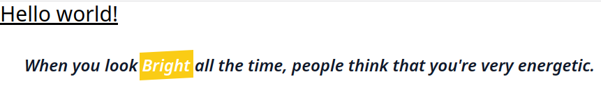
This code example:
<!doctype html>
<html>
    <head>
        <meta charset="UTF-8">
        <meta name="viewport" content="width=device-width, initial-scale=1.0">
        <link href="dist/output.css" rel="stylesheet">
    </head>
    <body>
        <h1 class="text-3xl font-bold underline">
            Hello world!
        </h1>
        <div class="my-10">
            <blockquote class="text-2xl font-semibold italic text-center text-slate-900">
                When you look
                <span class="before:block before:absolute before:-inset-1 before:-skew-y-3 before:bg-yellow-400 relative inline-block">
                    <span class="relative text-white">Bright</span>
                </span>
                all the time, people think that you're very energetic.
            </blockquote>
        </div>
    </body>
</html>
Will have this rendering result:
Customizable
Tailwind was created with the idea of being totally customizable and although it has everything necessary to be used from the start, if it is required to customize something of the theme/style these can be configured directly from the tailwind.config.js file, for example you can select only the colors that will be available for the site or if for some reason a color is not already predefined, it can be added directly. The same can be done with any other option of the site such as font types, screens, plugins, etc.